The Practical App Store Optimisation Guide We Hand to New Clients
App store optimisation is not a keyword exercise you finish once. It is the ongoing work of turning a store page into your best converting landing page, and this is the exact routine we walk new clients through.
Key takeaways
- App store optimisation has two jobs: get the page seen in search and browse, then convert the people who land on it. Most apps under-invest in the second.
- Metadata sets your ceiling. Use every character of the App Store name, subtitle and keyword field, and write the Google Play full description for search and for humans.
- The icon and the first two or three screenshots do most of the selling. Treat them as ad creative and test them like ad creative.
- Ratings and reviews are a product signal as much as a store signal. Ask happy users at a good moment and reply to unhappy ones quickly.
- Custom product pages, product page optimisation and Google Play experiments let paid traffic land on pages built for each ad. Run a monthly audit to keep it all honest.
01What app store optimisation really is (and why most teams stop too early)
When a new client tells us they have “done” their app store optimisation, they usually mean someone filled in the keyword field at launch and picked some screenshots the designer liked. That is a start. It is not ASO. On accounts we take over, the store page is often the most neglected asset in the whole growth stack, even though every paid click, every press mention and every word-of-mouth recommendation ends up on it.
Here is how we define it: app store optimisation is the ongoing practice of improving how often your app is seen in the App Store and Google Play, and how often the people who see it install. Visibility comes from metadata, ratings, downloads and relevance. Conversion comes from the icon, screenshots, preview video, reviews and the promise the page makes in the first few seconds.
Keyword research is part of the visibility half, and we cover it in depth in a separate guide. This piece is about the whole discipline: the parts that decide whether a visitor taps install or scrolls past.
The two numbers that matter
If you only track two ASO numbers, track impressions and product page conversion rate. Both stores report versions of these in their consoles. Impressions tell you whether the visibility work is paying off. Conversion rate tells you whether the page itself is pulling its weight. A rise in impressions with a falling conversion rate usually means you started ranking for searches that do not quite match what the app does, which is worth knowing before you celebrate.
02Why app store optimisation decides your paid media costs
We run app install campaigns every week, so we see the knock-on effect of the store page in hard numbers. An ad can win the click, but the install happens on the store page. If that page converts poorly, your cost per install goes up on every channel at once, and nobody inside the ad platform can fix it.
This is the point most founders miss: app store optimisation is not a separate organic project that runs alongside paid. It is the shared conversion layer under all of it. When we improve a store page for a client, we usually see the effect in three places:
- Paid efficiency. More of the people who click an ad go on to install, so cost per install falls without any change to bidding.
- Organic lift. Higher conversion and more installs can feed back into search and browse visibility over time.
- Better users. A page that sets honest expectations attracts people who stay. A page that oversells attracts installs that churn by Day 7.
That third point is why we never chase conversion rate at any cost. A store page that promises something the app does not deliver will convert well and retain badly. We would rather convert slightly fewer visitors who actually get value. If you want the wider context on how the store page fits into a full UA plan, our app user acquisition guide walks through the whole system.
03Metadata: the fields that set your ceiling
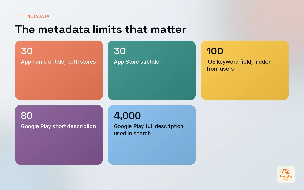
Metadata is the text both stores use to understand what your app is and when to show it. The fields differ between the two stores, and so do the rules about which text counts for search. Getting this table right is the first thing we check in any audit.
| Field | App Store | Google Play | Used for search? |
|---|---|---|---|
| App name / title | Up to 30 characters | Up to 30 characters | Yes, on both stores |
| Subtitle / short description | Subtitle, up to 30 characters | Short description, up to 80 characters | Subtitle yes on iOS; short description is read by Google Play |
| Keyword field | Up to 100 characters, hidden from users | No equivalent field | Yes, iOS only |
| Long description | Shown to users | Full description, up to 4,000 characters | Google Play yes, Apple no |
App name and subtitle
Your name should carry your brand plus the single most important descriptor, as long as it still reads like a name rather than a list. “Brand: Habit Tracker” is fine. “Brand Habit Tracker Planner Goals Routine” looks desperate and tends to convert worse. The subtitle on iOS is valuable real estate because it appears in search results. Use it for the benefit, written the way a user would say it, and include a phrase you want to rank for if it fits naturally.
The iOS keyword field and the Google Play description
On iOS, the 100-character keyword field is invisible to users, so it can be purely functional: comma-separated, no spaces after commas, no words that already appear in your name or subtitle. On Google Play there is no hidden field, and the full description is used for search, so it has to do both jobs at once. Write it for a person first, then check that your important phrases appear naturally a few times. Apple does not use the description for search, so on iOS that text is pure persuasion.
We keep the keyword method itself brief here, because it deserves its own process. The short version: pick terms by relevance first, then by how many people search them and how hard they are to win.
04Creative assets: icon, screenshots and preview video
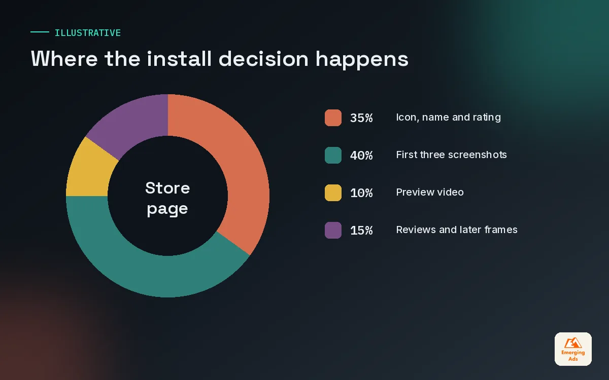
Metadata gets you shown. Creative gets you chosen. In search results, a visitor sees your icon, your name, your rating and usually the first few screenshots before they ever open the page. That glance is where most of the decision happens.
The icon
An icon has to work at a tiny size, next to competitors, on light and dark backgrounds. We test icons the way we test ad thumbnails: one bold shape, a clear colour that stands out in the category, no text that becomes unreadable when small. If every competitor uses blue, a strong orange icon earns a second look before anyone reads a word. Our Figma design team builds icon variants side by side in a mock search results grid, which is a far better way to judge them than looking at one icon on a white artboard.
Screenshots
Screenshots are not a product tour. They are a short sales argument told in frames. The first two or three carry most of the weight, because many visitors never swipe further. We brief them like this:
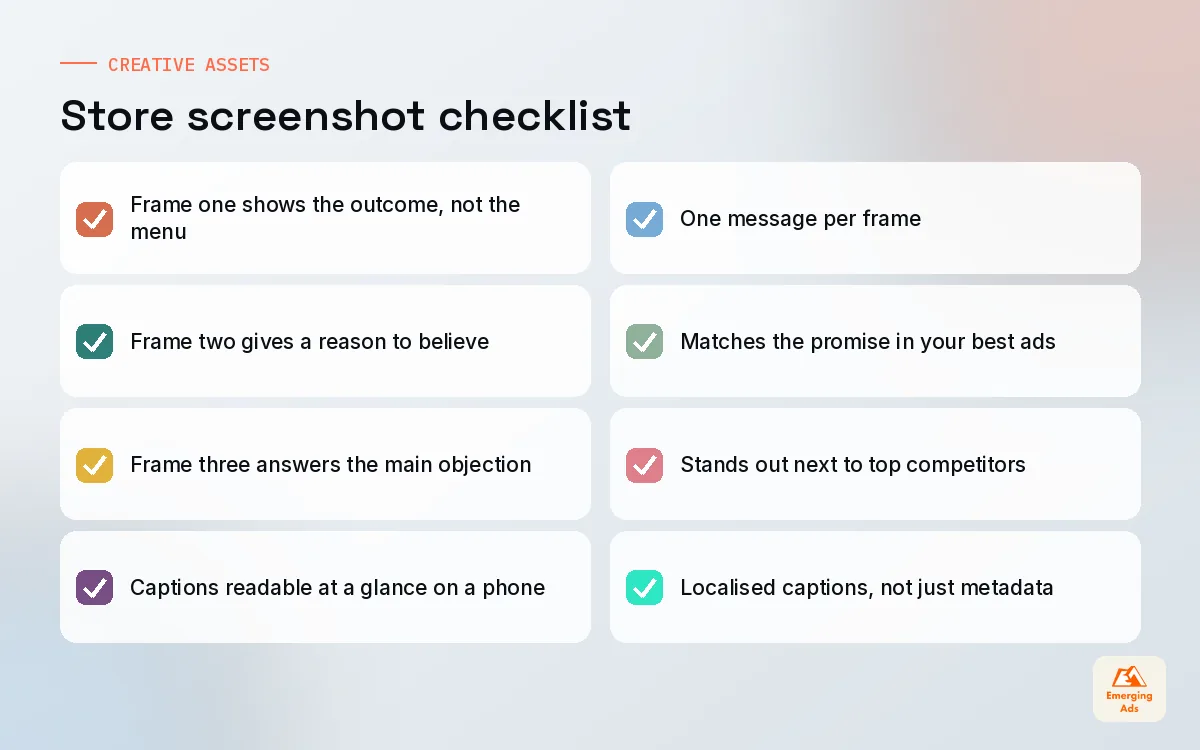
- Frame one: the outcome. What life looks like after using the app, in one line of large text over a clear product view.
- Frame two: the reason to believe. The feature or proof that makes the outcome credible.
- Frame three: the objection. Answer the thing that stops people installing, such as price, time or difficulty.
- Remaining frames: supporting features, social proof and anything that helps a careful reader decide.
Caption text should be short enough to read at a glance on a phone. If you need a paragraph to explain a screenshot, the screenshot is wrong. For teams that need to produce many variants quickly for testing, Canva design services are often a practical way to keep the sets consistent without tying up a senior designer.
Preview video
A preview video can lift conversion for apps that are hard to understand from stills, such as games, creative tools and anything with a satisfying interaction. It can also hurt if the opening seconds are a slow logo animation. Show the app doing its main job straight away. We often cut preview videos from the same footage as our best paid ads, with help from video content production, because those ads have already proven which moments stop the scroll.
05Ratings and reviews: the store signal you earn in the product
Ratings appear right next to your icon in search results, so they influence the tap before anyone reads your copy. They also tell you, in plain words, what users love and what annoys them. We treat reviews as free research every month.
Ask at the right moment
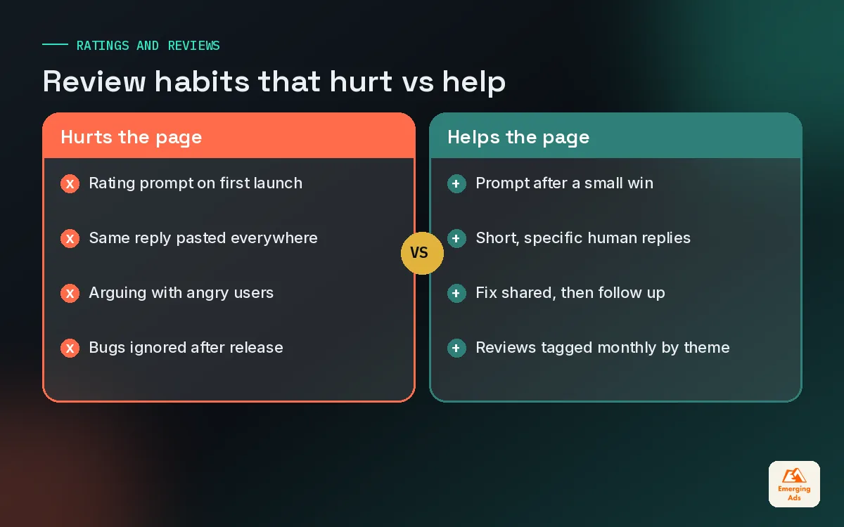
The best time to ask for a rating is right after a user has a small win: completing a workout, finishing a level, receiving a payment, saving their first document. The worst time is on first launch or right after an error. Both stores provide official in-app review prompts, and we always use those rather than custom pop-ups that push people towards the store. Track where prompts fire and pause them in any flow that has recently changed, because a bug in that flow will turn your ask into a one-star review.
Reply like a person
Replying to reviews shows future visitors that someone is listening. Keep replies short, specific and human. Thank people for detailed praise. For complaints, acknowledge the issue, say what you are doing about it, and invite them to contact support. Never argue, and never paste the same reply under fifty reviews.
| Review type | What it tells you | What we do |
|---|---|---|
| Crash or bug report | A real product problem, often version specific | Log it with the version, reply with a fix timeline, follow up once shipped |
| Pricing complaint | Paywall timing or value is unclear | Review the paywall and the screenshots that set price expectations |
| Feature request | Language for future messaging | Tag and count; the most common requests shape the roadmap and the store copy |
| Detailed praise | Your strongest positioning, in users’ words | Thank the user and borrow the phrasing for screenshot captions |
06Custom product pages and store listing experiments
This is where app store optimisation and paid media meet most directly, and where we see the biggest gap between what is available and what teams actually use.
Custom product pages on the App Store
Apple’s custom product pages let you create additional versions of your product page for different ads. Each version can have its own screenshots, preview videos and promotional text, and you send ad traffic to the matching page. If you run one ad about meal planning and another about grocery budgeting, each can land on a page that continues the same story instead of a generic page that tries to say everything.
We plan custom product pages around our main ad angles. When a new angle wins on Meta app campaigns, a matching custom page is usually one of the next things we build.
Product page optimisation and Google Play experiments
Apple’s product page optimisation lets you A/B test icons, screenshots and previews on the default page. Google Play offers store listing experiments for testing listing elements, and custom store listings for showing different listings to different audiences. Used together, these turn the store page from a guess into something you can improve with evidence.
| Tool | Store | Best used for |
|---|---|---|
| Custom product pages | App Store | Matching each ad angle to a page that continues its message |
| Product page optimisation | App Store | A/B testing icon, screenshots and previews on the default page |
| Store listing experiments | Google Play | Testing listing elements against each other |
| Custom store listings | Google Play | Showing a tailored listing to a specific audience |
How we run store tests
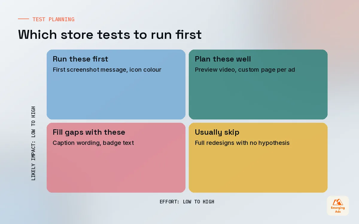
- One variable per test. Change the icon or the screenshot set, not both, or you will never know which one moved the result.
- Big swings first. Test a genuinely different first screenshot message before you test font sizes.
- Let it run. Give each test enough traffic and time to settle, and avoid launching tests during unusual traffic spikes such as a press feature.
- Write down the hypothesis. “Leading with price will lift conversion for budget-minded searchers” teaches you something even when it loses.
07Localisation basics for app store optimisation
Localisation is one of the most underused levers in app store optimisation. Many apps are available in dozens of storefronts but show the same English page everywhere. Translating metadata and screenshot captions properly, not word for word, can open up search traffic that competitors are ignoring.
The basics we follow with clients:
- Start where you already have traction. Look at which storefronts send installs without any localisation, and localise those first.
- Localise the meaning, not the words. A phrase that works in English may be awkward or meaningless when translated literally. Use native speakers who know the category.
- Rewrite screenshot captions. Text on screenshots is often the last thing teams translate and the first thing visitors read.
- Respect local proof. Reviews and ratings are shown per storefront, so a strong rating in one market does not automatically carry into another.
The research side of localisation works a lot like international SEO: the search behaviour changes market by market, and the winning terms are rarely direct translations.
A store page is the only landing page every single user sees. It deserves the same testing discipline as your best ad.
08Our monthly app store optimisation audit routine
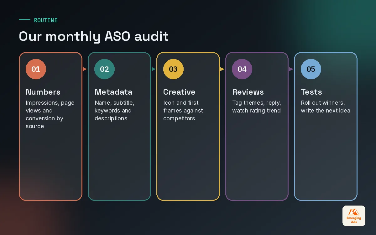
ASO decays quietly. Competitors update their pages, the stores change their layouts, reviews shift after a release and seasonal searches come and go. A short monthly routine catches most of it before it becomes expensive. This is the checklist we run on every app we manage.
| Step | What we check | Output |
|---|---|---|
| 1. Numbers | Impressions, page views and conversion rate by source in both consoles | A one-line trend note per store |
| 2. Metadata | Name, subtitle, keyword field, short and full description against current priorities | A list of changes for the next release |
| 3. Creative | First three screenshots and icon against the top five competitors | One test idea for the coming month |
| 4. Reviews | New reviews tagged by theme, reply status, rating trend since the last release | Product feedback and copy ideas |
| 5. Paid match | Each live ad angle mapped to a custom product page or listing | Gaps to build next |
| 6. Tests | Results of finished experiments and what we learned | Winner rolled out, next hypothesis written |
We report this alongside paid performance so the whole team can see cause and effect. A simple Looker Studio dashboard that puts store conversion next to cost per install by channel makes the conversation much easier than two separate reports from two separate teams.
Connect the store page to what happens after install
A page that lifts installs but lowers Day-7 retention is not a win. We check every store change against post-install behaviour in Mixpanel product analytics or the client’s own analytics stack, so we know whether we attracted better users or just more of them.
09When to bring in an app store optimisation partner
Plenty of teams handle app store optimisation well in-house, especially when a product marketer owns the store page and has design support. Outside help earns its fee when the store page sits between teams and nobody owns it, when paid spend is large enough that small conversion gains are worth real money, or when you are expanding into new storefronts and need a repeatable localisation process.
Our app store optimisation service sits next to our paid media team for exactly this reason. The people adjusting your screenshots can see which ad angles are winning that week, and the people buying traffic can see what the store page promises. You can see how ASO connects to the rest of what we do on our full list of services, or read more about our approach on the youremergingads.com homepage.
Whatever route you choose, start with the monthly audit. Fix the metadata, test the first screenshot, reply to your reviews, and give every major ad angle a page that continues its story. That alone puts you ahead of most apps in your category.
Frequently asked questions
Straight answers to what clients ask us most about app store optimisation.
What is app store optimisation?
How long does app store optimisation take to show results?
What is a good app store conversion rate?
Do ratings and reviews affect app store optimisation?
When should an app ask users for a rating?
What are custom product pages on the App Store?
What is the difference between product page optimisation and custom product pages?
How often should we update our app screenshots?
Is app store optimisation worth it for a brand new app?
Does paid advertising help app store optimisation?
Which languages should we localise our store page into first?
Can we do app store optimisation in-house?
Is your store page quietly wasting the traffic you pay for?
We will audit your metadata, creative assets, ratings and store tests side by side and hand you a ranked list of fixes. No slide deck, just the changes worth making first.
Book your free audit